
The Dashboard That Changes Everything: Why Team Communication Analytics Matter
What happens when leaders can actually see how their team communicates — and what to do about it
Here's a question every team leader should be able to answer: How good is your team at communicating?
Not "pretty good" or "we have some strong presenters." An actual number. A distribution. A trend line. The same precision you'd expect from your sales pipeline, your sprint velocity, or your customer satisfaction scores.
If you can't answer that question with data, you're not alone. Communication has been the last holdout of the "soft skill" era — important enough that every job description mentions it, but unmeasured enough that nobody actually knows where their team stands.
Ready to develop your team's voice?
Start a free trial →Until now.
What You're Looking At

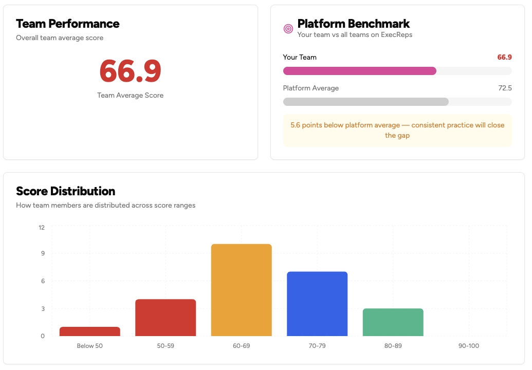
This is the ExecReps Team Analytics dashboard. Three panels. Zero guesswork.
Team Performance shows your team's average communication score — a single number that represents the collective quality of how your people present, persuade, and connect. In this example: 66.9. Not a feeling. Not a manager's gut check. A score derived from AI analysis of actual communication exercises.
Platform Benchmark puts that number in context. Your team at 66.9 vs. the platform average of 72.5. That 5.6-point gap isn't a failure — it's a direction. The dashboard doesn't just show you where you are; it shows you where you could be.
Score Distribution reveals what the average hides. That 66.9 isn't 25 people all scoring 67. It's a handful below 50, a cluster in the 60s, a strong group in the 70s, and emerging talent in the 80s. That shape tells a story — and the story is different for every team.
What Leaders Do Differently With This Information
We've watched what happens when team leaders get access to communication analytics for the first time. The pattern is remarkably consistent:
Week 1: The Shape Recognition. Leaders look at their score distribution and immediately see patterns they'd suspected but couldn't prove. "I knew we had a bimodal team — half our people are strong communicators and half are struggling. Now I can see it." The histogram doesn't lie. It doesn't play favorites. It just shows the shape of your team's communication capability.
Week 2: The Gap Response. That platform benchmark creates healthy competitive tension. Not toxic comparison — aspiration. When a VP of Engineering sees her team trailing the platform average by 5 points, she doesn't panic. She asks: "What would it take to close that gap by the end of the quarter?" Now she has a goal that's specific, measurable, and attached to something her team actually practices.
Week 3: The Targeted Intervention. Score distribution makes coaching efficient. Instead of running the same communication workshop for everyone, leaders can identify the 4 people below 50 who need fundamentals, the 10 people in the 60-69 range who need consistent practice, and the 3 people above 80 who should be mentoring others. Three different interventions. Same team. Ten times the impact.
Week 4+: The Culture Shift. Here's what surprised us most. Teams that look at their analytics weekly start talking about communication differently. It stops being a soft skill and starts being a team metric. People ask each other: "What are you working on in your workouts?" Managers reference the distribution in 1:1s. Communication becomes something you practice and measure, not something you hope you're good at.
The Three Questions Every Leader Should Ask
When you open your Team Analytics dashboard, focus on three questions:
1. What's my distribution shape?
Related Posts
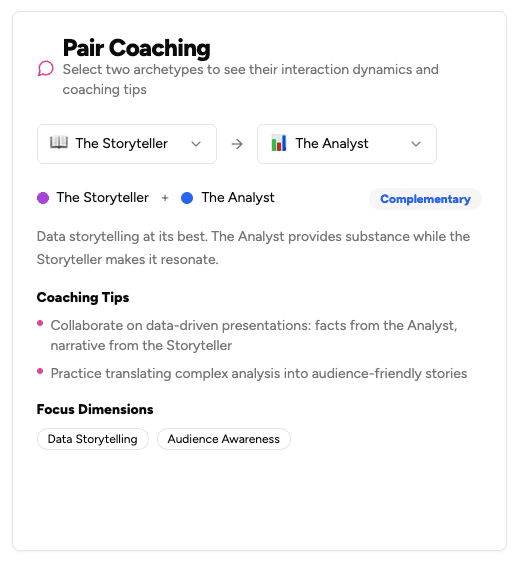
28 Coaching Conversations Your Team Should Be Having (But Aren't)
Every pair of communication archetypes has a unique coaching dynamic. We mapped all 28 combinations with ready-to-use 3-point agendas that turn any two teammates into growth partners.
4 min read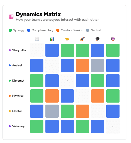
The Dynamics Matrix: Why Team Communication Is a Relationship Problem
Your team's communication issues aren't individual — they're relational. The Dynamics Matrix maps how every archetype pairing interacts, turning gut feelings about team chemistry into actionable intelligence.
4 min readGet insights from The Lab
Weekly research on voice science, executive communication, and leadership development. No spam, unsubscribe anytime.
